
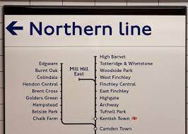
The headline above describes not only this blog post but also itself. That is, it consists of two words written in the Gill Sans font. The typeface has a storied past. It derived from Johnston, or Johnston Sans, created by Frank Johnston and used by London public transport (with some adjustments) ever since 1916. It is surely familiar to anyone who has ever ridden the tube in London.
Wikipedia informs me that Johnston is used for the logo of the fictional hospital where the American TV show House takes place (possibly a waggish nod to the Englishness of the actor who plays House, Hugh Laurie):

Eric Gill, a former assistant to Johnston, designed his own san serif font for the Monotype Company in 1928. It was dubbed Gill Sans and it gained wide currency due to its adoption by British Rail and, iconically, by Penguin Books.
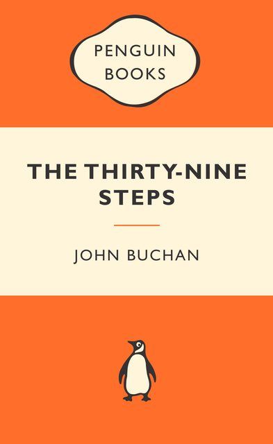
Aside from any aesthetic attributes, Gill Sans was used much more widely than Johnston because the latter was the copyright property of London Transport until 2015. If you have Microsoft Word, you can use Gill, but still not Johnston. In any case, I confess that if you put me in a room with some examples of Johnston and Gill Sans, I probably couldn’t tell the difference. But from what I can gather, all or almost all of the examples of this style I’m seeing more and more in America are Gill Sans. Like this:

And this

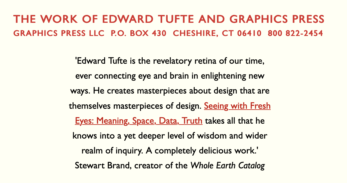
It’s used in the website and some of the published work of information design guru Edward Tufte:
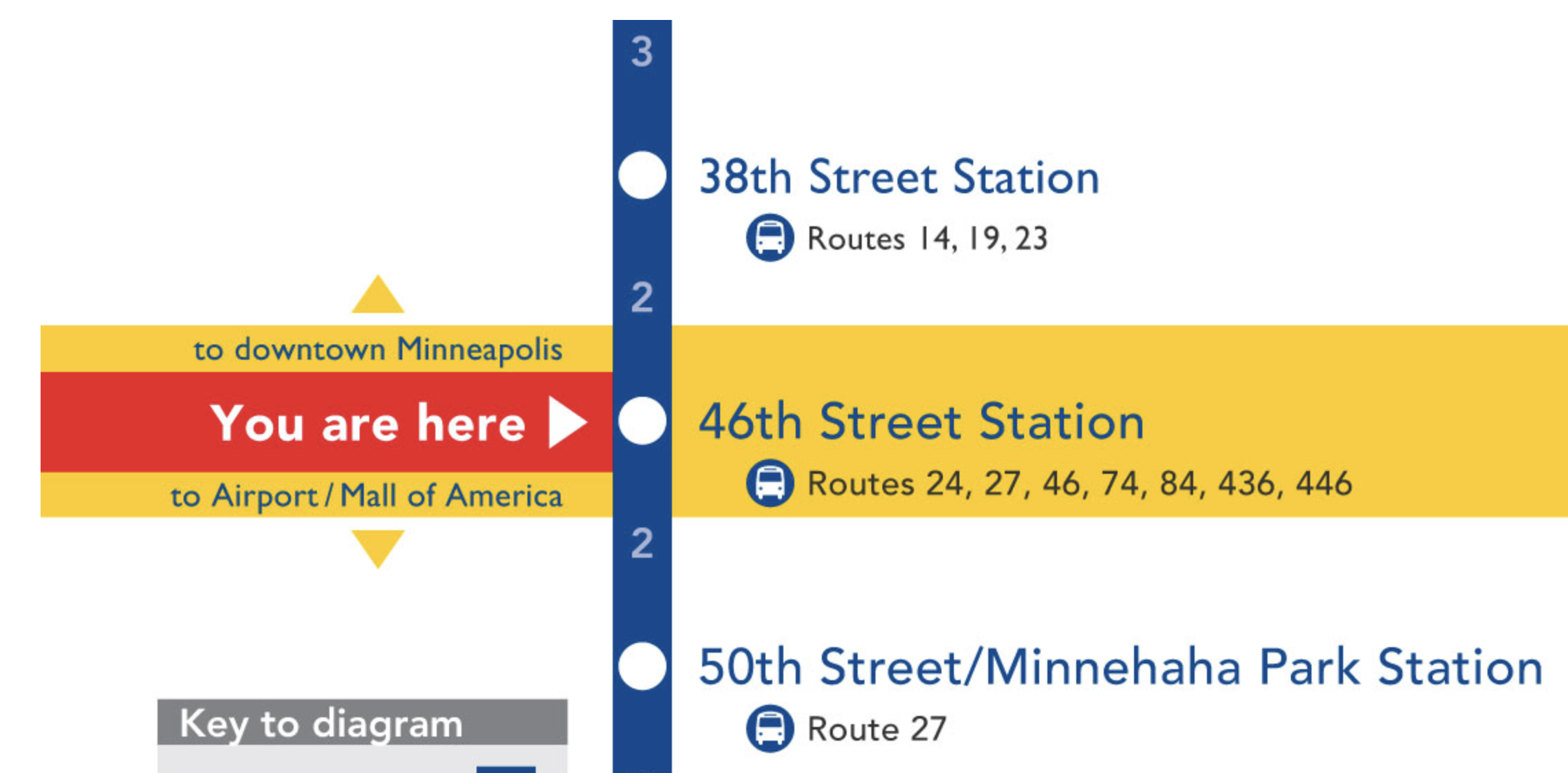
And, getting back to transport, in the graphics for the Hiawatha Light-Rail line in Minneapolis-St. Paul:

A much simplified and universally adopted text form……
Ironically, Gill’s sculpture at the BBC Broadcasting House in London of Prospero and Ariel is constantly under attack by people with hammers and much of his other works in Galleries are quietly being consigned to secure store-rooms.
Isn’t that because he was a self-confessed podophile?
Thus the BBC changing it’s font to BBC Reith?
A Podophile?
Did he really have a fetish for people’s feet?
I was assuming the correct word would be content-filter out….
You’d probably escape censure if you spelt it (correctly) as paedophile.
“censure” is a bit strong!
When the Americans find out about his “dog-friendly” activities then he will be cancelled for sure.
A literal interpretation of “dogging”, another British term yet to cross the pond.
For decades every British local printer had cases of the dreaded Gill, pushed by the Monotype Corporation and it wasn’t until the late fifties that Monotype persuaded printers to buy in Monotype Grotesque 215 and 216. Gill, in comparison with others sans faces (Univers, Standard, Venus, Folio in Europe and American Type Founders News Gothic and the Franklin range) is downright ugly. Gill is only used because designers, with their latest job, look at various faces to find one they haven’t used recently and unfortunately many pick Gill. I would like to think it’s a passing phase.
The great Eric Gill was a fine artist and sculptor.
Anyone visiting London will also see his work in various places such as Westminister cathedral, its leading Catholic church.
[image: image.png]
Marc Forster
nice, visually appealing, informative. you showed me yours; i’ll show you mine.
https://open.substack.com/pub/tripichickgmailcom/p/valerie-solanas-scum-founder?r=1kzo83&utm_campaign=post&utm_medium=web
I prefer Eyechart, from British eye charts, if you want a very simple font. https://fontsgeek.com/fonts/Eyechart-Regular